2617 N. Fowler Ave, Fresno CA 93727
Phone (559) 292-3800 Fax (559) 292-4900
|
2617 N. Fowler Ave, Fresno CA 93727 Phone (559) 292-3800 Fax (559) 292-4900
|
|
|
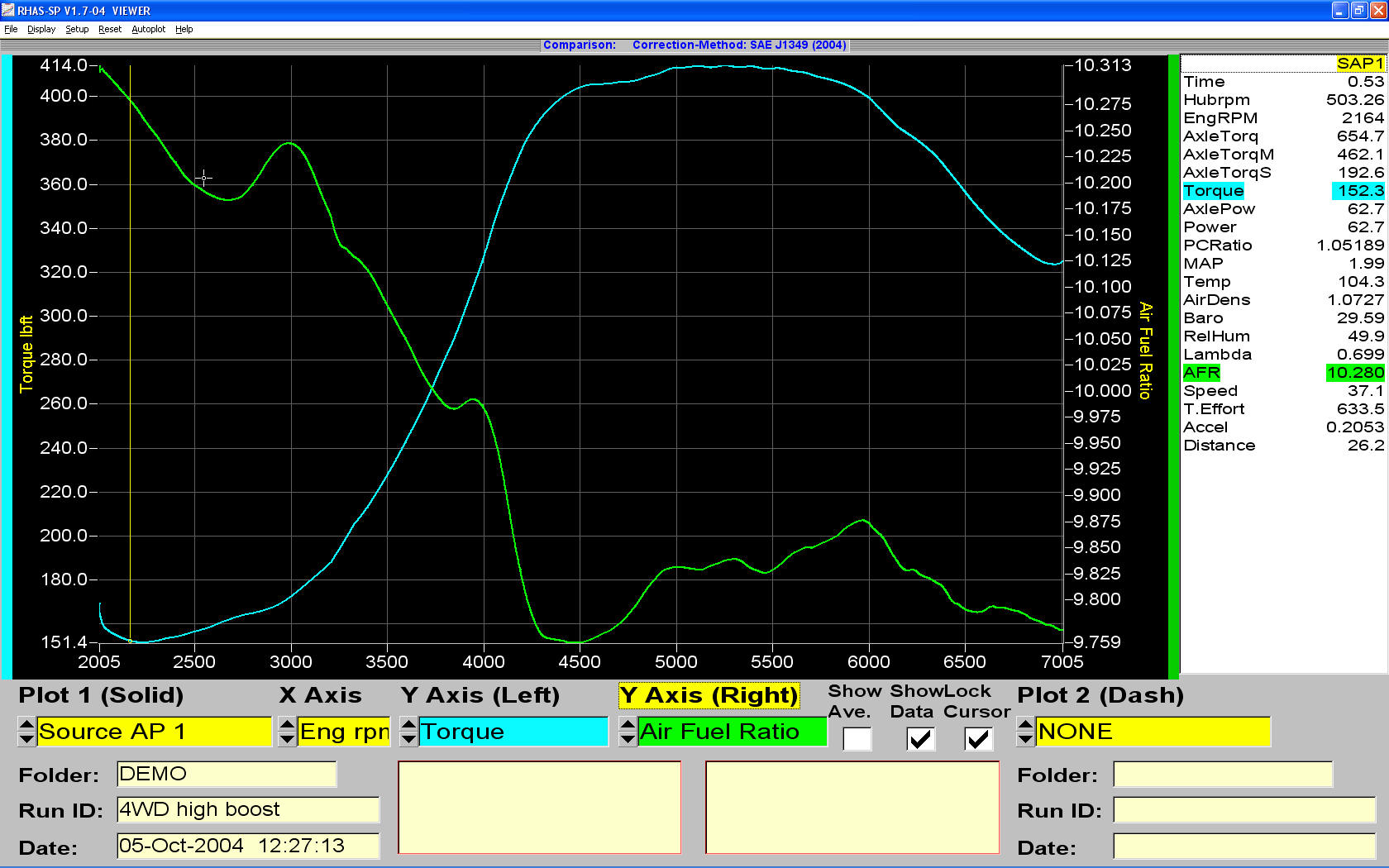
Comparison Screen:
In this screen, any of the measured data can be graphed and overlaid against any other data. Two different vehicle files or run files can also be compared. The horizontal scale can be RPM or time (shown). On the right side of the screen is a data window. This data corresponds to the placement of the yellow bar on the graph. The data window can also show the average value between two user-defineable points. The Y axis (left) and Y axis (right) boxes can select any of the data categories shown in the data window for display on the graph. This allows you to make custom graphs for things like Boost vs. Air/fuel ratio, etc. This type of flexibility makes it much easier to see how all of the collected data is inter-related and reduces the amount of time needed to reach conclusions. |